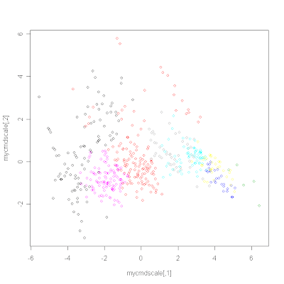
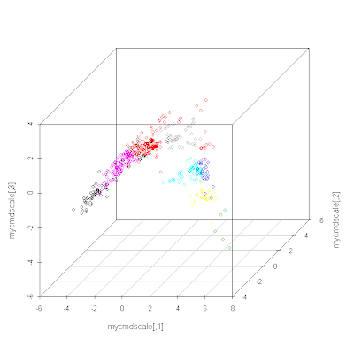
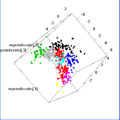
I'm a great believer in looking at the data. That is, checking it out visually. This is mainly as a sanity check. How real are these clusters? Did I forget to scale the data so that everything is clustered on the basis of the variable with the biggest range?
The following R code clusters using the non-hierarchical method k-means clustering (so no nice dendrogram). Once all the points have been assigned to a particular cluster you can look at the data in 2D or 3D (using principal coordinate analysis, aka classical multidimensional scaling) and colour the points by cluster:
data <- read.table("Boston.txt")
data <- scale(data)

myclust <- kmeans(data, 10)
print(myclust)
summary(myclust)
myclust$size
myclust$cluster

# Represent the data in 2D and colour by cluster
distances <- dist(data, method="euclidean")
mycmdscale <- cmdscale(distances, 2)
plot(mycmdscale, cex=0)
points(mycmdscale, col=myclust$cluster)

# Let's try 3D (you need to install scatterplot3d first)
library(scatterplot3d)
mycmdscale <- cmdscale(distances, 3)
s3d <- scatterplot3d(mycmdscale, color=myclust$cluster)

# Let's try interactive 3D
library(rgl) # Need to install this package first
plot3d(mycmdscale, col=myclust$cluster, size=5)


 Thanks to Rajarshi for pointing out how to generate the interactive 3D plot.
plot3d from the rgl package is what you want for interactive viewing of 3D pots in R.
ReplyDeletepersp is so 90's :)
That's great Rajarshi, I thought there was some way. I've added it above, although Blogger seems to be misbehaving when I try to add the new image.
ReplyDeleteThanks for the R info.
ReplyDeleteWhat is the format of the Boston.txt file?
Can we get a small sample of it too?
Cheers.
library(MASS)
ReplyDeletedata(Boston)
Thanks for the info, this was really helpful. I have a programming question though. So using cmdscale() on a distance matrix from microbial community data, I want to plot each set of replicate samples as a unique symbol and color (e.g., a green square). I figured it out for 2-dimensions but how do you do it in 3-dimensions using scatterplot3d() and plot3d() in the rgl package.
ReplyDeleteThanks so much!
Everything I know is in the post. I haven't been back to this since 2009. In the examples above, I note that the colour is set the same way for all three examples.
ReplyDelete